Frequently Asked Questions
-
How do I start?
If you have a large raw data and want to analyse the data first and then visualise, use "Data Analyser".You can also explore some ready made analysis using publicly available data by clicking "Explore Sample".
-
How to use ChartMaker?
Just 2 steps:
Step1: Upload an Excel File
Step2: Select type of chart, type of colorstyle and columns to be plotted
Once you click the submit button, chart will be generated and displayed as an image file. You can download it and use in reports, presentation etc. You also have the option to download the chart as an editable excel file.
-
Is there any restriction on the Excel file?
1. The file should be a valid (.xlsx or .xls) file. Macro enabled file (.xlsm) is not accepted.
2. The file size should be upto 2 mb.
3. The data in the file must start from the first row and first column. There should not be any preceding blank row and column.
4. At least one of the column should be of non-numeric type. These types are usually used as the category column. Needless to say, the data must have at least 2 columns.
-
Can I edit the output chart?
The output chart can be downloaded as an Excel file and you can edit it as per your requirement.
-
What are the different types of charts possible?
Currently we support creation of 12 types of chart which in turn consists of a total 57 subtypes.
Out of these, Gauge chart can be created without uploading any data file. For the other charts, data file should be uploaded.
-
Bar Chart
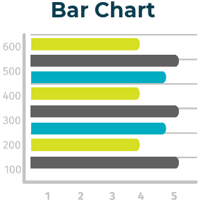 Bar chart is one of the most versatile charts. You can use multiple data series plotted on the same bar chart.
There are 6 types of bar charts supported in our platform. You can choose any of them.




Points to be noted :
1. It is easier to understand this type of chart when the data is sorted. Lucky for you, we do it for you even if your data file is not sorted.
2. If you are not sure which type if best for your purpose, you can use 'Show All types' button. This will generate all the 6 options so that you can compare side by side and choose.
-
Column Chart
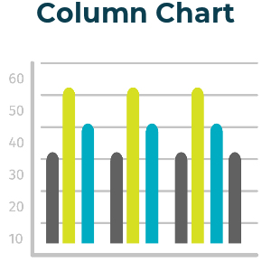 Column chart is one of the most versatile charts. You can use multiple data series plotted on the same bar chart.
There are 7 types of column charts supported in our platform. You can choose any of them.




Points to be noted :
1. It is easier to understand this type of chart when the data is sorted. Lucky for you, we do it for you even if your data file is not sorted.
2. If you are not sure which type if best for your purpose, you can use 'Show All types' button. This will generate all the options so that you can compare side by side and choose.
-
Line Chart
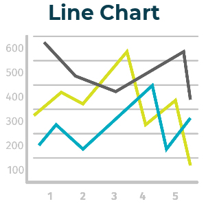 Line chart is one of the most versatile charts. You can use multiple data series plotted on the same bar chart.
There are 7 types of column charts supported in our platform. You can choose any of them.




Points to be noted :
1. It is easier to understand this type of chart when the data is sorted. Lucky for you, we do it for you even if your data file is not sorted.
2. If you are not sure which type if best for your purpose, you can use 'Show All types' button. This will generate all the options so that you can compare side by side and choose.
-
Pie Chart
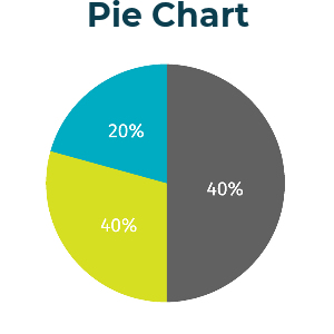 Pie chart is one of the most versatile charts. You can use only one data series on a Pie chart.
There are 6 types of pie charts supported in our platform. You can choose any of them.


Points to be noted :
1. If you are choosing 'Pie of Pie' or 'Pie of Bar' chart, not that the number of data to be shown in the 2nd pie or bar is decided based on your input data. You can of course edit it in the output Excel.
2. If you are not sure which type if best for your purpose, you can use 'Show All types' button. This will generate all the 6 options so that you can compare side by side and choose.
-
Cone Chart
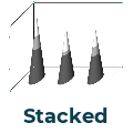
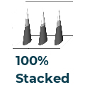
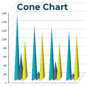 Cone chart is a variation of 3D Bar and Column chart where the bars are represented as cone. You can use Multiple data series on a Cone chart.
There are 7 types of Cone arts supported in our platform. You can choose any of them.


Points to be noted :
1. Like all other charts, in case of a Cone chart also, the output can be downloaded as an Excel. However, the image output in the browser is limited for 3 sub types only.
2. If you are not sure which type if best for your purpose, you can use 'Show All types' button. This will generate all the 6 options so that you can compare side by side and choose.
-
Cylinder Chart
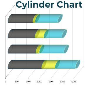 Cylinder chart is a variation of 3D Bar and Column chart where the bars are represented as cylinder. You can use Multiple data series.
There are 7 types of Cylinder arts supported in our platform. You can choose any of them.


Points to be noted :
1. Like all other charts, in case of a Cylinder chart also, the output can be downloaded as an Excel. However, the image output in the browser is limited for 3 sub types only.
2. If you are not sure which type if best for your purpose, you can use 'Show All types' button. This will generate all the options so that you can compare side by side and choose.
-
Area Chart
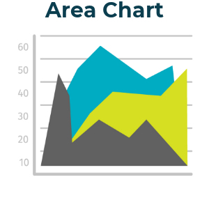 Area cahrt can have Multiple data series.
There are 6 types of Area charts supported in our platform. You can choose any of them.
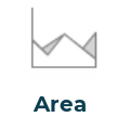

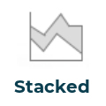
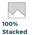

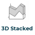
Points to be noted :
1. Like all other charts, in case of a Area chart also, the output can be downloaded as an Excel. However, the image output in the browser is limited for 3 sub types only.
2. If you are not sure which type if best for your purpose, you can use 'Show All types' button. This will generate all the options so that you can compare side by side and choose.
-
Pyramid Chart
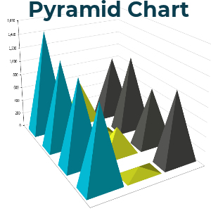 Pyramid chart is a variation of 3D Bar and Column chart where the bars are represented as pyramid. You can use Multiple data series.
There are 7 types of Pyramid charts supported in our platform. You can choose any of them.


Points to be noted :
1. Like all other charts, in case of a Pyramid chart also, the output can be downloaded as an Excel. However, the image output in the browser is limited for 3 sub types only.
2. If you are not sure which type if best for your purpose, you can use 'Show All types' button. This will generate all the options so that you can compare side by side and choose.
-
Doughnut Chart
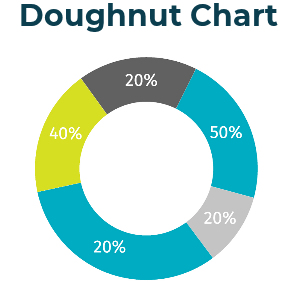 Doughnut chart is very similar to pie chart. The difference is that it has a central hollow portion.
Although technically you can use Multiple data series in this type of chart, it is not recommended. Hence, we restrict it to 1 data serie.
There are 2 types of Doughnut charts supported in our platform. You can choose any of them.


Points to be noted :
1. If you are not sure which type if best for your purpose, you can use 'Show All types' button. This will generate all the options so that you can compare side by side and choose.
-
Waterfall Chart
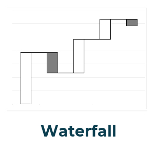
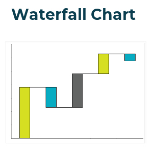 Waterfall chart is a very common chart used for data analysis. It is particularly helpful in understanding the relative contribution of the data points and doing analysis such as 80-20% (i.e which data points contribute to 80% of the total).
Points to be noted :
1. The sequence of the data is important in the series. If you are interested to know the top contributors of the total, you should sort the data in decreasing order.
2. For other type of analysis, leave the data as it is.
-
Combination Chart
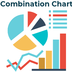 Combination chart, as the name suggests is a combination of more than 1 type of charts.(e.g. a bar chart and a line chart)
You can only add 2 types of charts as adding more than that can make the final output messy.
Although technically you can make any combination, some of those combination may not be as per the best practices and we take care of it in our platform.
Steps to be followed :
1. Select the X axis category
2. Select Y axis variables.
3. For each of those Y variables, specify the type of chart and whether it should be displayed on the secondary axis.
4. As mentioned above, you can choose only 2 types of charts (even if the number of variables are more than 2).
-
Gauge Chart
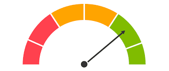 Gauge chart is usually used to show the progress or status of certain activity with respect to the final expected outcome.
Usually, it is represented in % of total and some nomenclature can be given to a range of values. For example, we can label 0-20% fullfillment as Poor while 80-100% fullfillment as Excellent.
This is a chart for which you do not need to upload any Excel file.Steps to be followed :
1. Select how many labels you want to show. We have an option of 1, 3 or 5.
2. Mention the actual % value of the data. It can be a customer satisfaction score, or project completion status or any such metric.
3. Mention whether you want the direction of the chart from Right to Left or vice versa. (optional)
4. Mention caption (optional).
-
Data Analyzer
Data Analyzer should be used when you want to analyse the data in Excel file.
Based on the input parameters, the output is generated as a series of charts and tables. These can be exported in multiple formats.
-
Input data for Data Analysis
1. The file should be a valid (.xlsx or .xls or.csv) file. Macro enabled file (.xlsm) is not accepted.
2. The file size should be upto 2 mb.
3. Row 1 of the sheet must contain the column headers. Column A can not be blank. In other words, the data in the file must start from the first row(1) and first column(A). There should not be any preceding blank row and column.
4. The data should not have any merged cells.
5. There should not be any column with blank header.
6. The data must be continuous. That means no blank row or column should be in between.
If the data has any of the above inconsistencies, the file will not be accepted.
-
Analysis Parameter
Any data analysis is an answer to a question. When an input file is uploaded, we need to specify the parameters to form this question. The generic format of the question is :
How does 'A' and 'B' vary over 'C' and 'D' over 'T' ?
Here, 'A','B','C','D','T' are different paramaters (column headers) taken from the input data file. Note that,
'A' and 'C' are mandatory parameters.
'B' ,'D' and 'T' are optional parameters.
'T' is time-parameter.
Sample context : If 'A' denotes 'Sales value', 'B' - 'Net Profit', 'C' - 'Regions', 'D' - 'Product Category', 'T' - 'Sale date( summarised in month/ quarter etc.)', then we can frame these queries by selecting different parameters.
1. How does 'Sales value' vary with with respect to 'Regions'?
2. How does 'Sales value' and 'Net Profit' vary with with respect to 'Regions'?
3. How does 'Sales value' vary with with respect to 'Regions' and 'Product Category'?
4. How does 'Sales value' and 'Net Profit' vary with with respect to 'Regions' and 'Product Category'?
5. How does 'Sales value' vary with with respect to 'Regions' over time('Sale Date')?
6. How does 'Sales value' and 'Net Profit' vary with with respect to 'Regions' over time('Sale Date')?
7. How does 'Sales value' vary with with respect to 'Regions' and 'Product Category' over time('Sale Date')?
8. How does 'Sales value' and 'Net Profit' vary with with respect to 'Regions' and 'Product Category' over time('Sale Date')?
Summary Method: By default, 'SUM' is used as the summary method. But we can change it to
a. AVERAGE b. COUNT c. UNIQUE COUNT
Steps to be performed:
1. Upload the file
2. Choose the variable which you want to summarise ('A' from the above discussion)
3. Choose independent variables based on which you want to summarise ('B', 'C' from above discussion. You may choose only one)
4. Choose time variable 'T' (optional)
5. Default summary method is Sum. You can also choose Count, Average and Unique Count.
6. Submit
-
Output chart, table, presentation
1. The number of output charts depends on the number and type of input parameters selected.
2. It may vary from 1 to 4.
3. All the charts are displayed as image format as well as raw Excel file.
4. Additionally, a presentation file is also created. This is an easy way to go through the entire analysis summary.
-
Data Privacy
We understand the importance of data protection. To ensure strict confidentiality :
1. No input file is stored in our server. The files are deleted automatically immediately after some core inputs are extracted. This usually takes few seconds. All further steps are performed in this system readable numbers and not on the original data file.
2. These system readable numbers are transported to the user browser for display of the interactive dashboard. The transmission to the browser happens through a secure encrypted SSL/TLS handshake process.
3. The output charts and reports are generated in the user's browser. None of these are stored in the server.
Since we delete the user file almost immediately after upload, can an user run multiple analysis after uploading the file once? Read here.
-
Linking of files
Sometimes your data may reside in multiple files and for the purpose of analysis, you may want to connect those. In Excel, we achieve this using lookup functions (like Vlookup).
Using Data Analyzer, you have 2 options :
Option 1. Before uploading any file, edit the base data file with linked columns. In this case, only one file should be uploaded.
Option 2. Upload 2 files in the portal and use the "link file" feature. In this case, 2 files are uploaded.
One file contains the main data on which you want to run the analysis. 2nd file is the reference file and it is linked to the first file.
Steps for linking:
i. In the "Data Analysis" page, choose 1st file (Base data)
ii. Click yes to the question "Do you want to upload 2nd file?"
iii. Upload the 2nd file.
iv. In the next screen :
iv a. Choose the linked column from 1st file
iv b. Choose the linked column from 2nd file
These 2 columns now form a bridge and any other column from the 2nd file will now be visible in the next step.
-
One Data, Many Analysis
Since we take data security to be the foremost priority, we delete user file almost immediately after upload.
Scenario 1. User uploads data, runs the analysis and closes the browser/ tab/ becomes idle. In this case, sessions is closed and user needs to upload the file again to run a new analysis.
Scenario 2. User uploads data, runs the analysis and moves to a new tab. Although the session is not closed, the data is lost and user needs to upload the file again.
Scenario 3. User uploads data and runs the analysis. At this point, the user can click the button "New Analysis". User can run a new analysis without uploading the file again. This is the suggested method for "upload once, run multiple analysis".
-
Export Output
There are 3 types of export that you can use :
1. Exporting individual chart as image: Cick "Export" button just below the chart. There will be several format options to choose from. The image format options are :
1. .jpeg
2. .png
3. .svg
Click one of them. Now you can specify the output file name in the next input box. Click ok.
The image file will be downloaded in your local 'download' folder.
2. Exporting chart data: Cick "Export" button just below the chart. There will be several format options to choose from. The data format options are :
1. .xlsx
2. .csv
Click one of them. Now you can specify the output file name in the next input box. Click ok.
The data file will be downloaded in your local 'download' folder.
3. Exporting all the charts at one go: On top of the page, click "Export Charts". A PDF file will be downloaded in your local download folder. This will contain all the charts in the dashboard.
-
Explore Sample Analysis
We analysed some real world data (publicly available) and displayed the some relevant graphs and chart. The data sources are mentioned at the landing page. We will continue to add more such analysis.
If you have any dataset which you want us to analyse or if you just have an idea, please reach out to us. We are always eager to find insights from data.